Choosing the right paint color for your dining room can change everything—from the mood at your dinner parties to how comfortable you feel every day. You might wonder what colors decorators pick to create that perfect balance of warmth, style, and appetite appeal.
This isn’t just about picking any shade; it’s about finding the color that makes your space inviting and uniquely yours. You’ll discover the top paint colors decorators trust to transform dining rooms into stunning, cozy places where memories are made.
Keep reading, and you’ll find the inspiration you need to make your dining room truly shine.
Credit: www.jennasuedesign.com
Popular Dining Room Colors
Dining rooms set the mood for meals and gatherings. Choosing the right paint color makes a big difference. Decorators pick colors that create a warm and inviting space. Some colors make the room feel cozy, while others make it bright and fresh. Here are the popular dining room colors designers choose today.
Warm Neutrals
Warm neutral colors like beige, taupe, and soft gray are top choices. These shades create a calm and cozy atmosphere. They match well with wood furniture and natural fabrics. Warm neutrals also make the room feel larger and more open. They provide a simple background that highlights decor and food.
Bold And Dark Shades
Dark colors such as navy blue, deep green, and charcoal add drama. These shades create a rich and elegant dining space. Bold colors can make the room feel intimate and stylish. They work well with gold or brass accents. Dark walls also help bright colors and artwork stand out.
Soft Pastels
Soft pastel colors like pale blue, mint green, and blush pink bring freshness. These colors make the dining room light and airy. Pastels give a gentle and peaceful feeling. They fit well in casual or modern dining spaces. Soft pastels brighten the room without being too strong.
Color Psychology In Dining Spaces
Colors in dining rooms do more than decorate walls. They influence mood and appetite. Choosing the right color can create a warm, inviting space. It can make meals feel more enjoyable and relaxing. Understanding color psychology helps decorators pick shades that work well in dining areas.
Colors That Stimulate Appetite
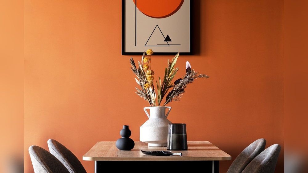
Red is a popular choice to boost hunger. It brings energy and excitement to the room. Orange also encourages eating and social interaction. These warm colors make food look more appealing. Yellow adds a cheerful vibe, which can make meals more fun. These colors create a lively dining experience.
Calming Hues For Relaxed Meals
Blue tones help calm the mind and slow eating pace. Soft greens connect with nature and promote peace. Light gray offers a neutral, soothing background. These colors suit quiet dinners and long talks. They help diners feel comfortable and less rushed.
Trending Finishes And Textures
Dining rooms have become more than just places to eat. They are spaces to gather and relax. Paint finishes and textures play a big role in setting the mood. Decorators now pick from a wide range of options that add depth and style.
Choosing the right finish or texture can change the entire feel of the room. It can make the space feel cozy, bright, or elegant. Understanding these trends helps in making smart color choices.
Matte Vs. Glossy
Matte finishes offer a soft, smooth look. They hide wall flaws well and give a calm feel. Matte paint works great in dining rooms with a cozy vibe.
Glossy finishes shine and reflect light. They make colors pop and add energy. Glossy paint suits modern dining rooms that want a fresh, clean look.
Decorators often mix both finishes. Matte walls with glossy trims create contrast. This mix adds interest without overwhelming the space.
Textured Paint Effects
Textured paints add a unique touch to dining room walls. They create patterns and depth that plain paint cannot.
Popular effects include suede, sand, and linen textures. These finishes bring warmth and a natural feel to the room.
Textured walls work well with neutral and earthy colors. They add subtle beauty that invites guests to stay longer.

Credit: www.chairish.com
Combining Paint With Decor
Combining paint with decor in a dining room creates a balanced and inviting space. The right paint color enhances furniture and decor items. It sets the mood and style for the entire room. Choosing colors that work well with your furniture and accents makes the room feel complete and cozy.
Matching Furniture And Walls
Matching paint colors with furniture brings harmony to the dining room. Soft neutral walls pair well with wood tones. Light colors make dark furniture stand out. Dark walls highlight light or metallic furniture. Choose paint shades that reflect the style of your furniture. This makes the room feel unified and stylish.
Accent Walls And Color Blocking
Accent walls add personality without overwhelming the space. Pick a bold color for one wall to create a focal point. Color blocking uses two or more colors in blocks or stripes. It adds energy and interest to the room. Use accent walls and color blocking to highlight decor or artwork. These techniques bring depth and fun to dining rooms.
Lighting Impact On Color Choices
Lighting plays a big role in choosing paint colors for dining rooms. It changes how colors look and feel. The right color in one light may look different in another. Understanding lighting helps pick colors that create the perfect mood. It also makes the space feel warm and inviting. Let’s explore how natural and artificial light affect color choices.
Natural Light Considerations
Natural light comes from windows and doors. It changes throughout the day. Morning light is soft and warm. Afternoon light is bright and cool. North-facing rooms get less sunlight and often feel cooler. South-facing rooms get more light and feel warmer. Light affects how paint colors appear. Dark colors may look softer in natural light. Light colors can feel brighter and more open.
Consider the size and direction of windows. Large windows bring more light and make colors look lively. Small windows or shaded rooms need lighter paint to avoid feeling dark. Natural light can highlight flaws or textures in the paint. Test paint samples at different times of the day to see true color.
Artificial Lighting Effects
Artificial light includes lamps, chandeliers, and ceiling lights. It changes the color tone based on the bulb used. Warm bulbs add a yellow or orange glow. Cool bulbs add a blue or white glow. Warm light makes colors feel cozy and soft. Cool light can make colors look sharp and crisp.
Dining rooms often use warm lighting to create a comfortable space. Bright white light may make colors look harsh. Dimmer switches help adjust light and change how colors appear. Consider the lighting style when picking paint. A color that looks good under warm light may look dull under cool light.
Test paint colors under the room’s artificial light. Look at the color in the evening and at night. This helps ensure the paint suits the lighting and mood you want.
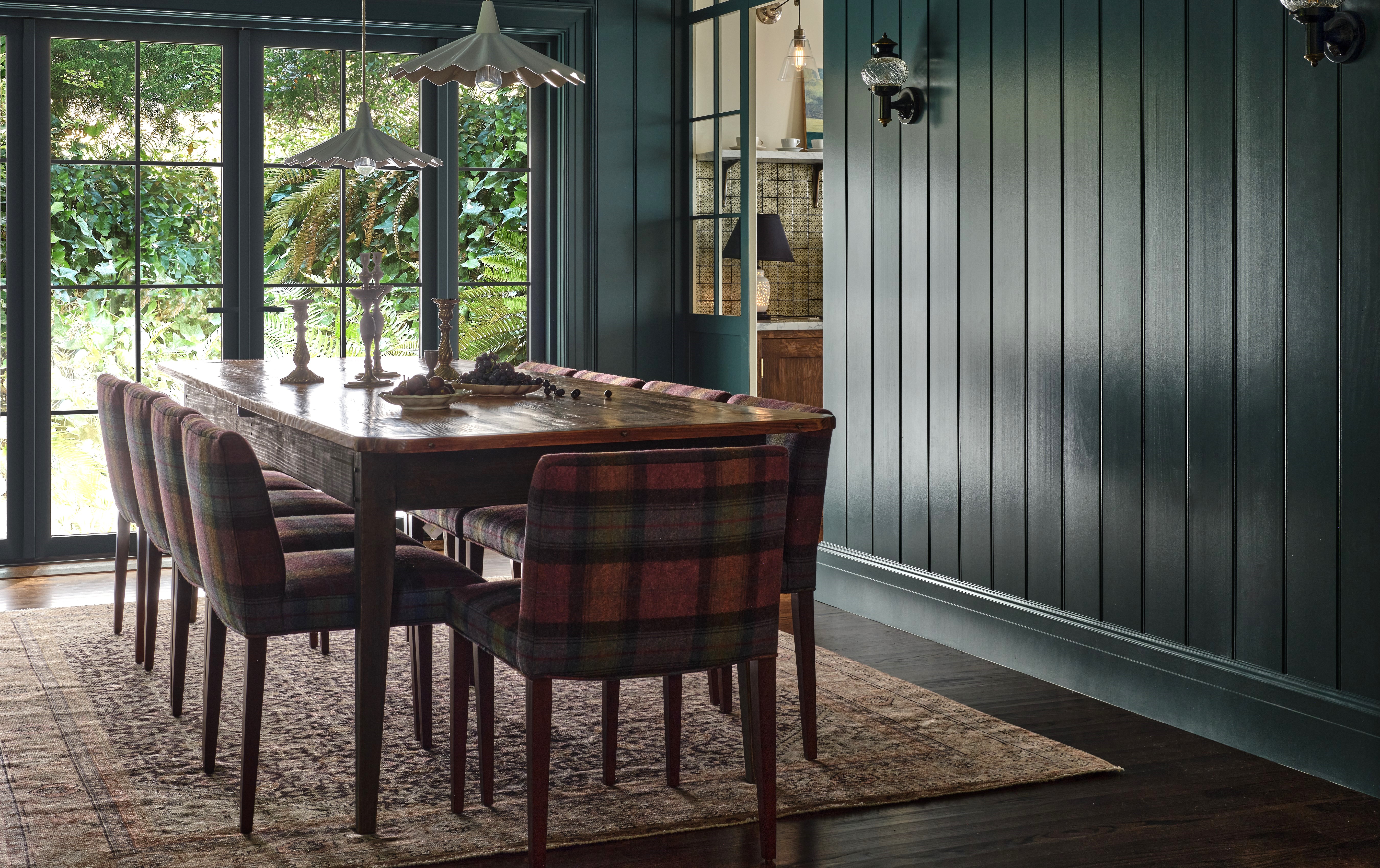
Credit: www.livingetc.com
Seasonal And Timeless Options
Dining rooms are special places for meals and memories. Choosing the right paint color sets the mood. Some colors change with the seasons. Others stay fresh year after year. Knowing these options helps create a beautiful dining space.
Seasonal and timeless colors both have strong appeal. They can highlight your style and make guests feel welcome. Colors that fit each season bring energy and warmth. Classic shades offer calm and balance through all months. Both types help make your dining room inviting and stylish.
Colors For Every Season
Bright reds and oranges bring fall to life. They match autumn leaves and cozy vibes. Soft pastels like pink and lavender fit spring well. These colors feel light and fresh. Summer calls for cool blues and greens. They remind us of water and nature. Winter works best with deep blues and grays. These shades add calm and a touch of elegance. Changing paint with seasons is easy and fun. It lets your dining room reflect the time of year.
Classic Shades That Endure
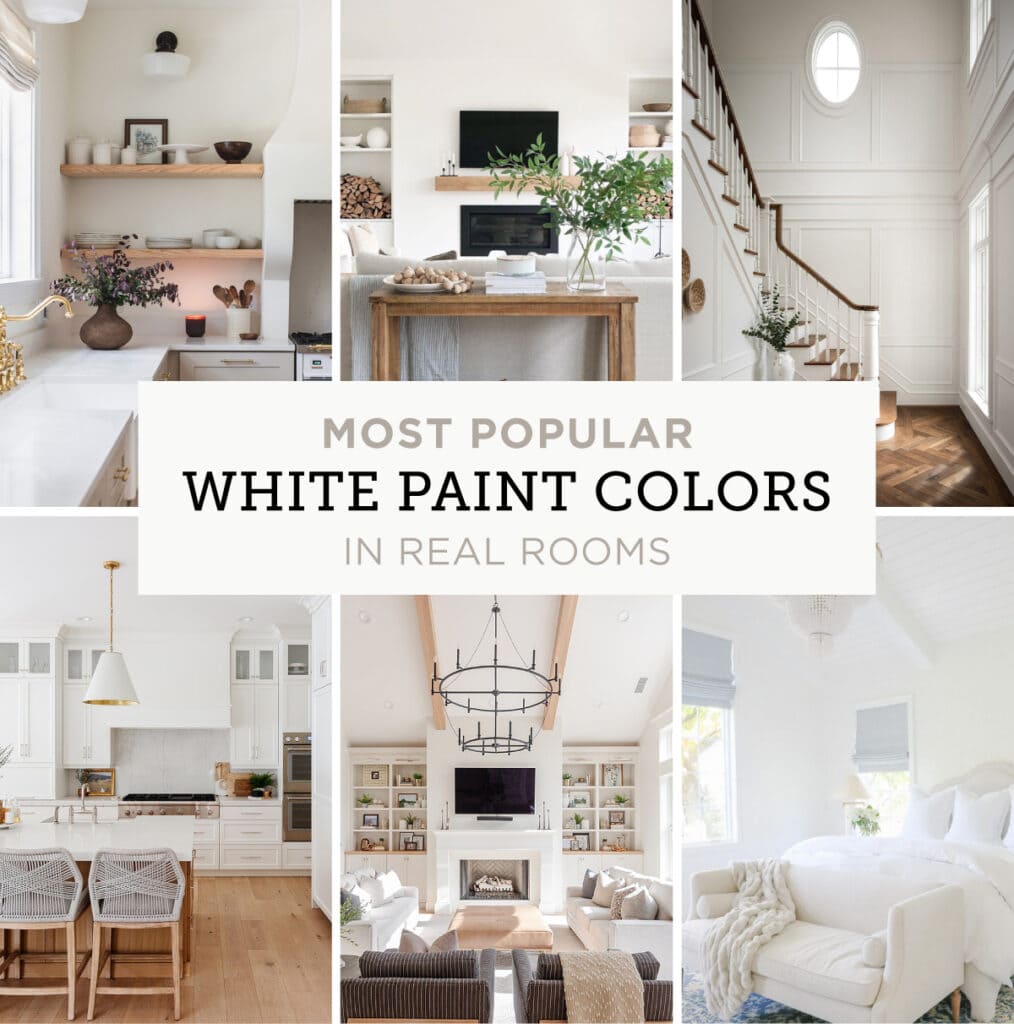
Whites and creams never go out of style. They make rooms look big and bright. Warm grays add softness without dullness. Navy blue brings depth and richness. Earthy tones like beige and taupe create calm spaces. These colors work all year long. They match many furniture styles and decorations. Choosing a classic shade means less repainting. Your dining room stays beautiful through every season.
Frequently Asked Questions
What Are The Top Paint Colors For Dining Rooms?
Decorators often pick warm neutrals, soft blues, and rich greens. These colors create a cozy and inviting dining atmosphere. They enhance natural light and complement various decor styles.
How Do Paint Colors Affect Dining Room Ambiance?
Paint colors influence mood and perception. Warm tones boost appetite and conversation. Cooler shades promote calmness and elegance. The right color balances comfort and style for dining spaces.
Should Dining Room Colors Match Furniture Or Walls?
Decorators recommend coordinating colors, not matching exactly. Walls often feature subtle tones to highlight furniture. Contrasting colors can add depth and interest while maintaining harmony.
Are Dark Paint Colors Suitable For Dining Rooms?
Yes, dark colors like navy or charcoal add sophistication. They create an intimate setting ideal for dinners. Proper lighting is essential to prevent the room from feeling cramped.
Conclusion
Choosing the right paint color sets the dining room’s mood. Decorators often pick warm tones to create a cozy feel. Soft blues or greens bring calm and freshness. Neutral shades keep the space simple and elegant. Remember, color affects how people feel and interact.
Your dining room paint should reflect your style and comfort. Small changes can make a big difference. Trust your taste and enjoy the process. The perfect color makes meals and moments more special.